Unconsulting: designing a digital presence from zero for a modern consulting firm
Unconsulting is an immigration and HR consulting firm built around 30 years of real corporate experience. It exists to offer individuals, attorneys, and businesses a clearer, more human alternative to traditional legal and consulting firms without the bloat, the jargon, or the outdated digital presence that defines most of its competitors.
There was no website, no business plan, no content, and no structure before I came on. I built all of it.
Starting from zero
Naveen had 30 years of experience and was ready to go independent. The problem was everything around the experience did not exist yet. No website, no structure, no way to present what he did.
The space he was entering did not make it easier. Law firm sites look ancient. Consulting sites look clean but feel empty. We had to build something that felt like neither.
Turning a messy idea into a clear flow
Starting from zero meant the first challenge was not design, it was discovery. I had to extract a full service offering from a client who knew what he did but had never had to package or present it. Six distinct client types across two service categories, each needing their own pathway, their own messaging, and their own reason to trust.
All of this needed to resolve into a single, clear digital experience that never felt complex, because the subject matter already was.
An app-like experience for mobile users
I cross questioned the client extensively to extract the full scope of services, defined the information architecture, wrote and structured all copy, designed the UI, and built the entire site in Framer. The Open Letter on the About page was developed through a deep interview with Naveen. I took his thoughts and voice and shaped them into something a visitor would actually read and remember.

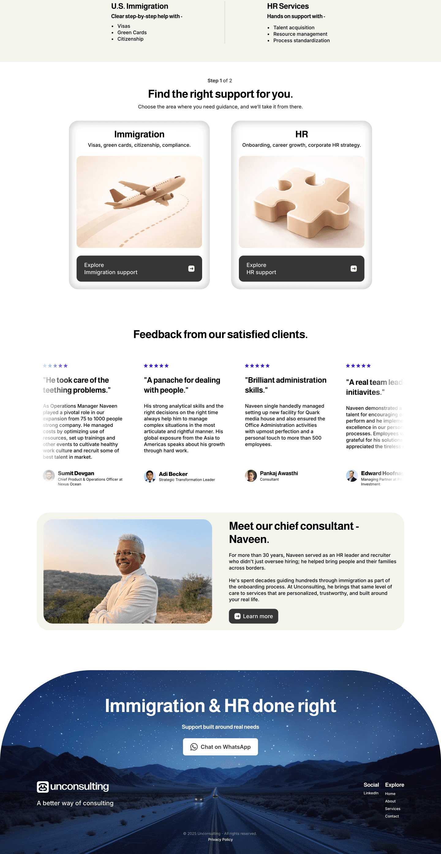
Making the product easy to understand
The core design challenge was routing six client types through two service categories without creating confusion. I built a two step selection system: visitors first choose between Immigration and HR, then self select as Individual, Attorney, or Corporate. Each path opens a focused service detail panel with specific offerings and a direct CTA.
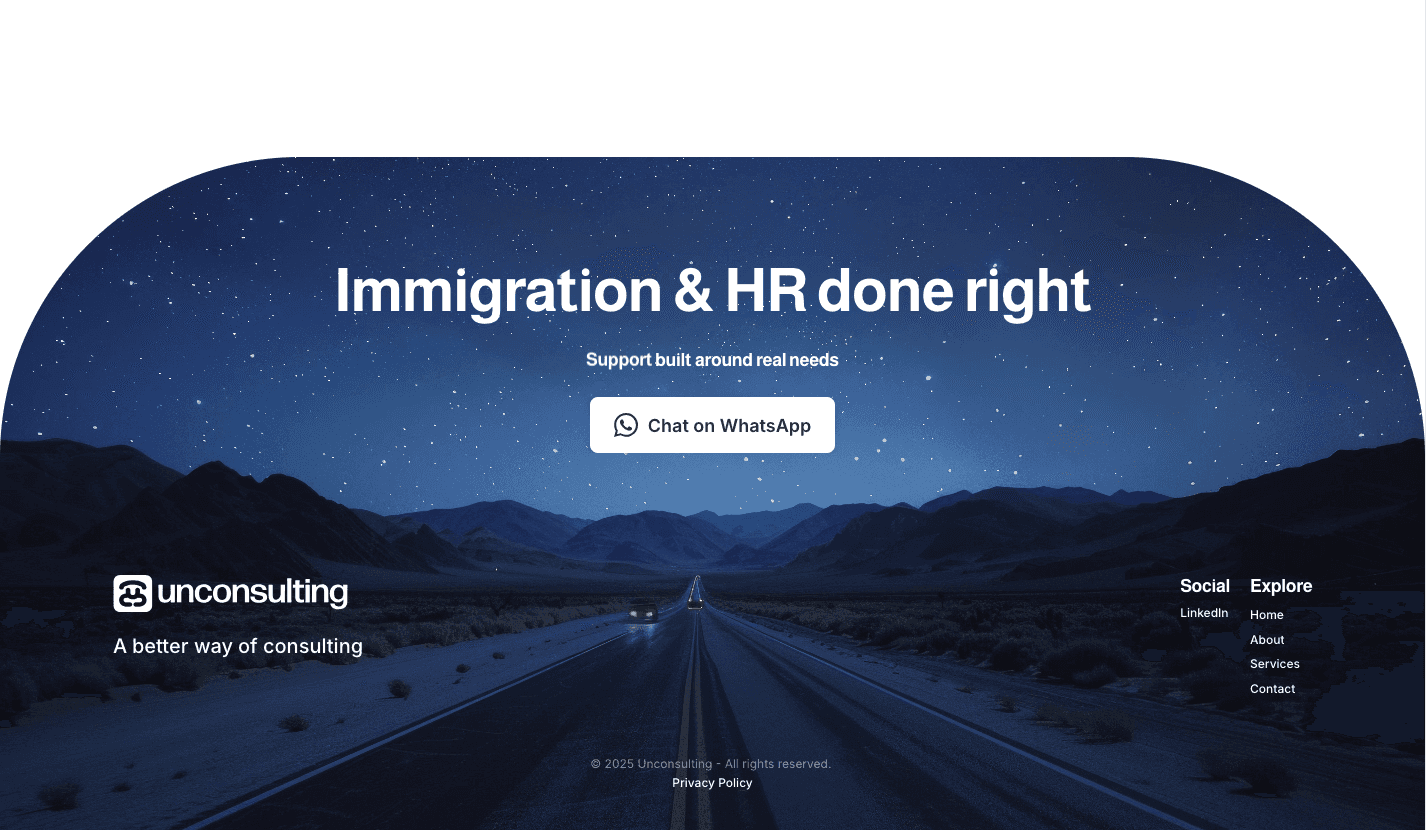
This structure meant no visitor ever had to read through services that were not relevant to them. Every path terminates at the same destination: a contact form or WhatsApp, because one on one conversation is the conversion goal for a service this sensitive.
Building trust through storytelling
Designed as a trust building and routing experience. The homepage establishes credibility immediately and then gives visitors a clear, low friction path to self select their service category.
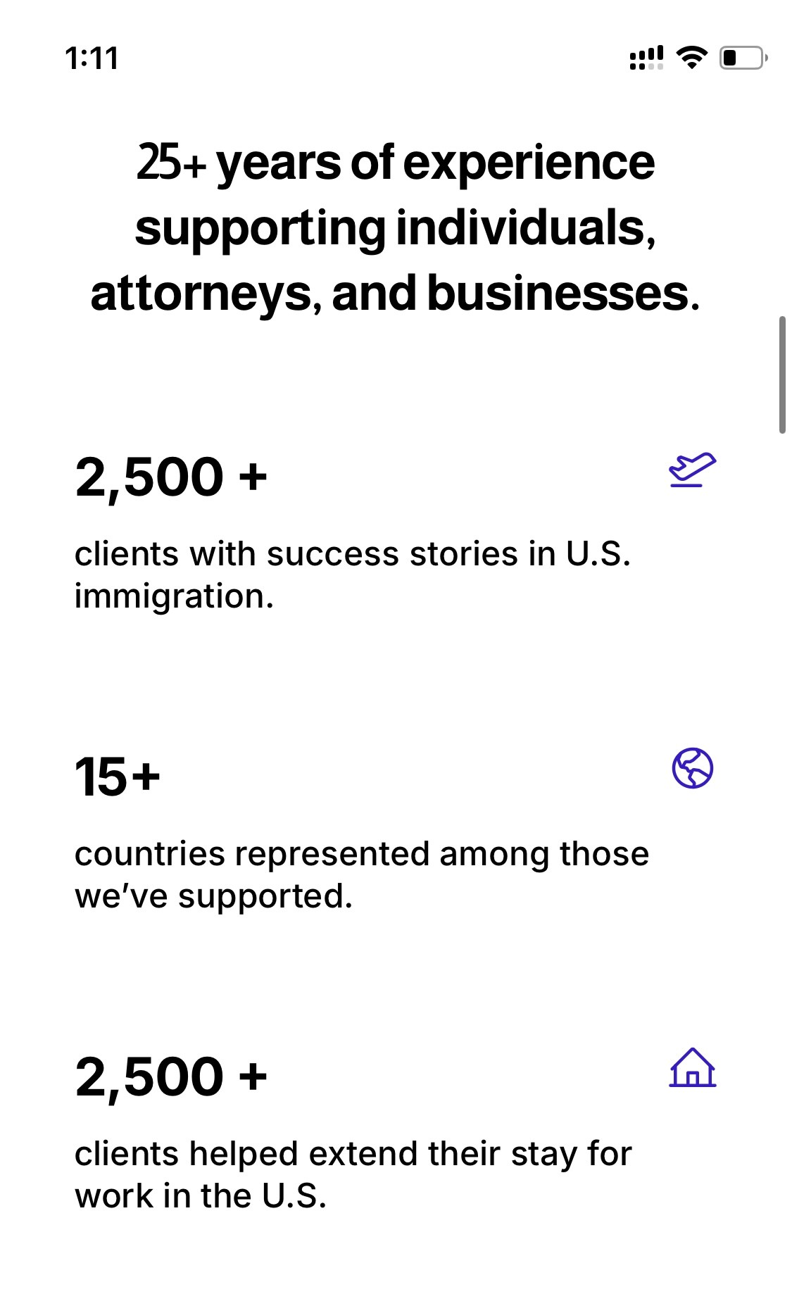
Testimonials from attorneys, executives, and corporate leaders are surfaced mid page to reinforce credibility across every client type the site serves. All traffic flows toward one action: starting a conversation.
Making the brand feel human
Instead of a standard bio, I built the About page around an Open Letter from the CEO. The content was developed through a structured interview with Naveen — I extracted his perspective, his philosophy, and his 30 years of lived experience and translated it into copy that is poetic, authoritative, and human.
This page does the trust work that no credentials section can. It tells the visitor who they are actually talking to and why that matters.
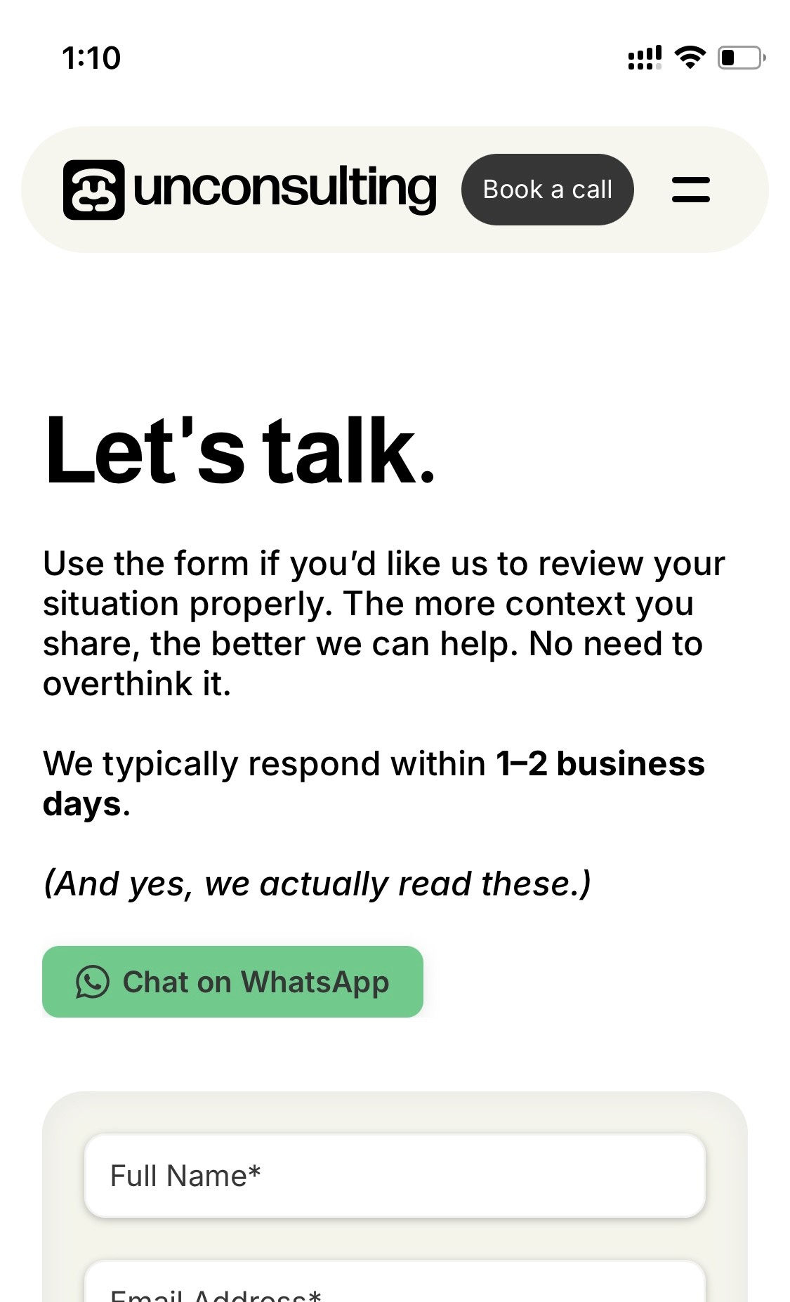
Made booking simple and instant
Every CTA across the entire site routes to the contact form. This was a deliberate strategic decision — Naveen's service is sensitive and personal, and the first point of contact needs to be a real conversation, not a checkout flow.
WhatsApp was integrated as a contact option throughout the site because a significant portion of the client base is international, particularly across India and the US, where WhatsApp is the primary mode of professional communication.
Results
The business went from no digital presence to a credible, fully operational platform in one month. Naveen now has a structured way to communicate his services, qualify inbound interest, and build trust before a single conversation takes place.
Delivery
Full site, service architecture, and copy shipped in one month
User flow
6 distinct pathways across 2 service categories
Contact channels
Integrated booking, contact form, and WhatsApp
Key Takeaways
Product thinking before design thinking. The first deliverable on this project was not a layout, it was a business structure. Understanding what Naveen offered, who he offered it to, and how those two things connected was the real design problem. Getting that right made everything else straightforward.
Information architecture is a conversion tool. Routing six client types cleanly through two service categories without friction required careful structural thinking. The two step funnel reduced complexity for the visitor while ensuring no service offering was buried or missed.
In sensitive service categories, trust is the product. Immigration and HR consulting are high stakes decisions. Every design choice, from the Open Letter, the testimonials, the WhatsApp option, and the one on one contact focus, was made to reduce anxiety and increase confidence before anyone picked up the phone.
Let's get started!
If you’re thinking about a new website or redesign, I’d love to hear about it.
© 2026
Sachit Bhardwaj
email:
sachit0202@gmail.com